About this project
Overview
Jubilee is a tool for planning weddings that simplifies communication between wedding planners to multiple parties. This was a conceptual project where I collaborated with 2 other designers.
Goal
The goal of this project was to enhance the communication experience for wedding planners.
My Role
At this project, I was also responsible for creating wireframes and interactive prototypes for user experience on the desktop and tablet platforms.
Deliverbles
Mobile App, Responsive web App, Tablet app
Duration
November -December 2022
Skills
User research
Product thinking
Prototype
Usability testing
Interaction design
information architecture
Team
3 designers, 1 product manager, 1 engineer
Problem
Wedding planners encounter the challenge of effectively coordinating multiple vendors.
Wedding planners help couples plan their dream weddings by ensuring that the big day runs smoothly. However, even with the best-laid plans, they are still stressed when effective communication is lacking, which leads to misunderstanding and errors.
Solution
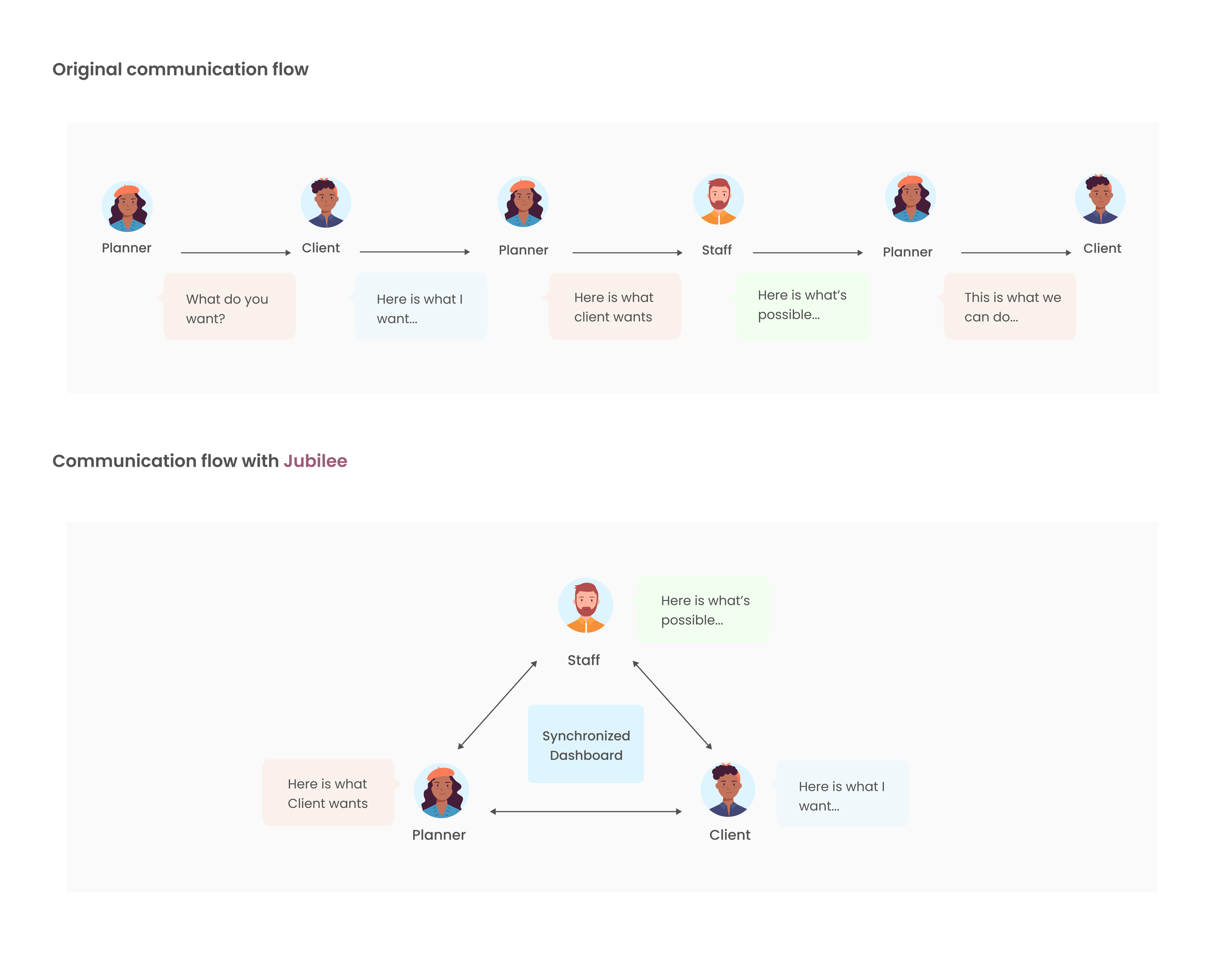
A platform that synchronizes all communications for all parties at real time.
An intuitive desktop dashboard that facilitates efficient communication of updates between planners and various parties.
Easy to navigate, Edit, and share.
For Planner (web page)
For Clients (Mobile)
No more confusions or surprises
A web-based mobile dashboard that allows couples to edit inspirations and stay informed about updates made by planners.
A web-based tablet dashboard that allows planners to assign tasks to team members and keep everyone on schedule quickly without constantly following up one by one for status.
Prepared for unexpected, stay in control
For Staffs (Tablet)
Research
Planners spend a significant amount of time communicating with different parties.
We conducted one-on-one user interviews to gather detailed insights into planners' experiences, attitudes, and behaviors.
We spoke with four planners and learned that they spend a lot of time on phone calls, texting, and emailing. This is because they need to have multiple conversations to confirm or inform a single decision. When communication is not efficient, it leads to mistakes and misunderstandings.
We realized that what wedding planners really need is :
“The better it is when things can communicate with each other and provide answers without my direct involvement. It's like having a strong team.
Brainstorming & Ideation
How might we create a platform that allows planners to communicate with clients and staff efficiently?
After voting in 3 rounds of crazy 8s, we realized that reducing unnecessary conversations is the key. Therefore we decided to create a synchronized dashboard that streamlined communication among all parties enabling efficient real-time information sharing for planners. We sketched out the user flow to visualize this idea.
Creating a cross-platform design
Based on user flow and user needs, we create a cross-platform design for this concept. We analyze platform-specific tasks and create wireframes for mobile, desktop, and tablets.
Task scenario: Notifying client about a change
Tablet scenario: Assigning tasks during wedding
Style Tile
Reflections
It was my very first experience working on a group project. Throughout the entire design process, I found myself constantly surprised and inspired by the unique ideas brought forth by my teammates. Even it took some time to merge our different viewpoints into a final decision, but it help us create a design that truly puts the user at the center.
What’s next
In a limited timeframe, we accomplished the design of a functional application across three distinct platforms and received positive feedback from our mentor. Moving forward, we aim to conduct user usability tests and further develop this product into an improved solution for wedding planners.
Next Project: AI Health>


