About this project
Better Ed was a conceptual project that I initiated and completed from user research to the final prototype by myself.
Overview
Goal
Find a solution to help parents make confident decisions when choosing schools for their kids.
This was a solo project, I independently worked on the entire design process from concept to final delivery, which included user research, usability testing, wireframing, and prototyping.
My Role
Duration
Aug 2022-Nov 2022
UI/UX Design
UX research
Hi-Fidelity Prototype
Usability testing
Skills
The Problem
Parents are overwhelmed researching schools for their children.
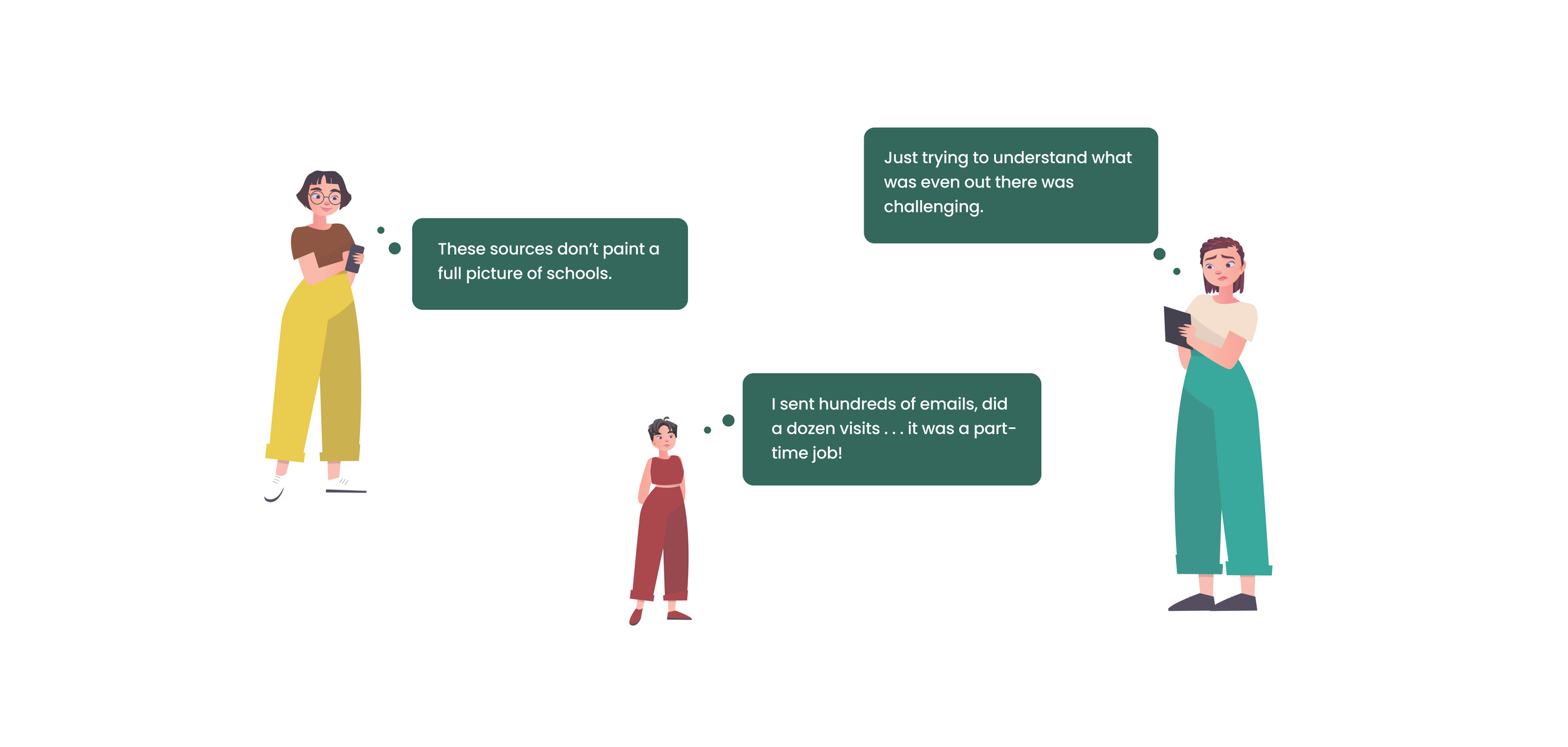
Each parent has his or her own set of criteria and expectations when it comes to selecting a suitable school for their children. Despite the availability of various magazines and websites that provide recommendations and ratings of schools, research can still be difficult for most parents due to the lack of emphasis on different research platforms.
The solution
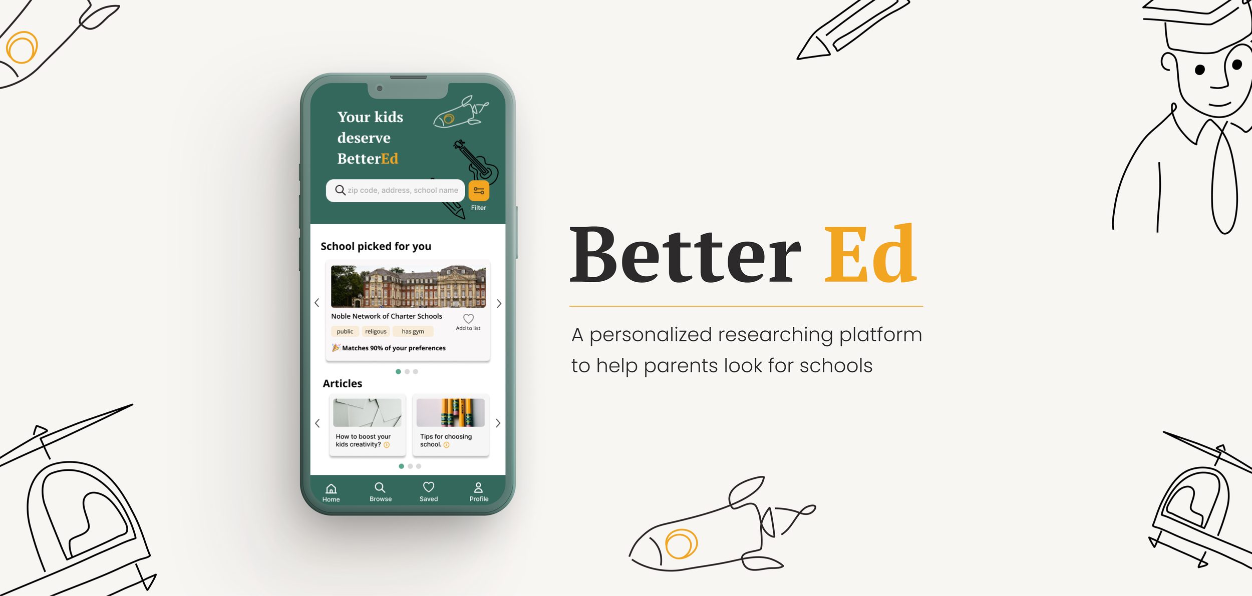
A personalized school research platform that saves parents from endless research.
The impact
The final design doubled the speed of the school research process for parents.
I finally got the number of people taking surveys increased by 70%.
At a single glance, parents can view the percentage of their requirements fulfilled by a school, along with a concise summary listing the criteria that matter to them.
Instantly See Your Requirements Met
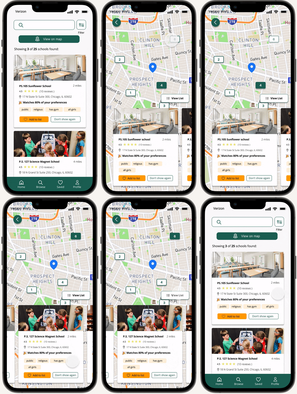
Parents can easily navigate through different locations while keeping an eye on other important details of the school.
Easily Search Schools by Locations
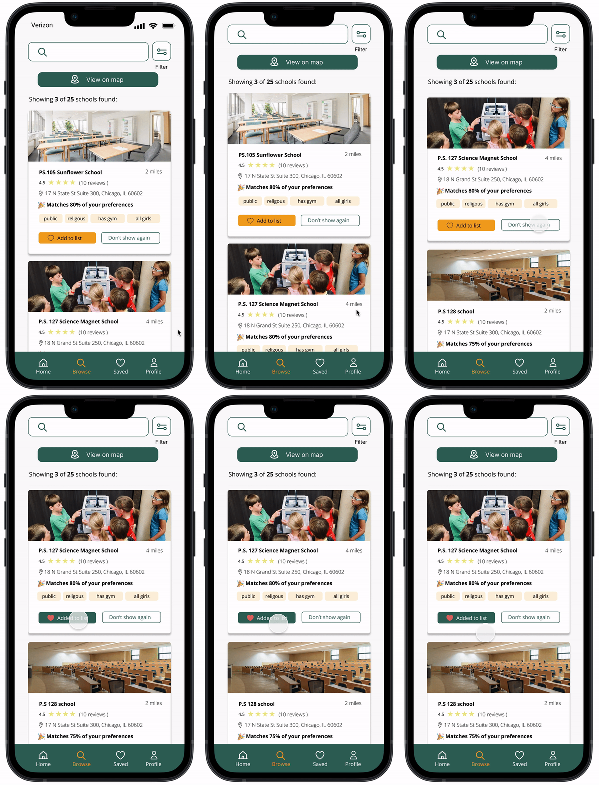
Parents can personalize their school search by liking schools of interest and hiding those that don't meet their preferences with just a click, making it easier to focus on the schools that matter most.
Customize Your School List with a Click
Research
To better understand why parents are stressed during the school search, I proceeded with qualitative research by conducting user interviews with 6 parents.
A talk with parents
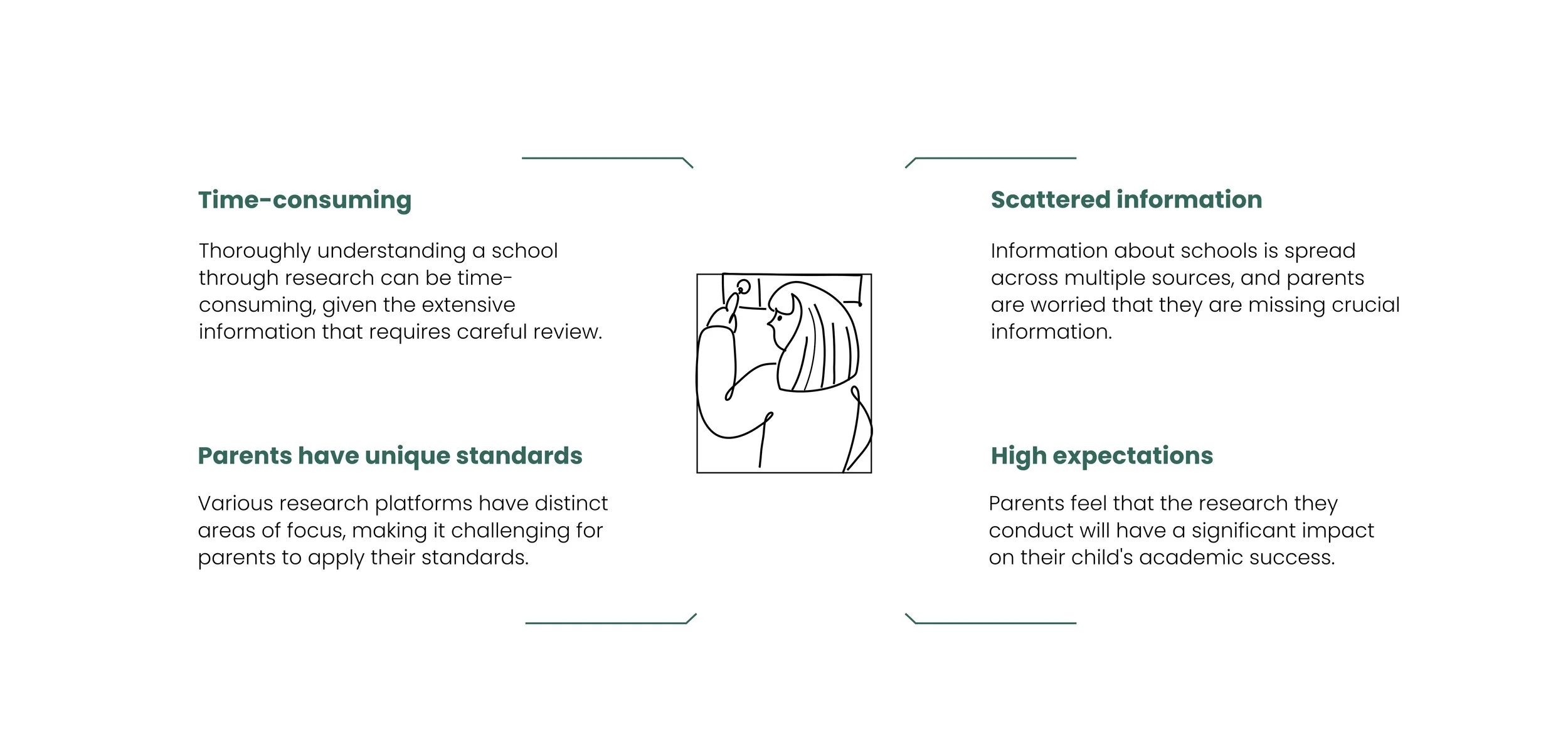
During the interviews, I discovered that parents often struggle the most during the discovery and research stage. With scattered information and hours of reading, they strive to reach the right conclusion. Therefore, I decided to focus on helping parents efficiently discover and research schools without adding stress and frustration.
Parents are most stressed during the discover and research stage.
What I found
Insights
Why are they stressed?
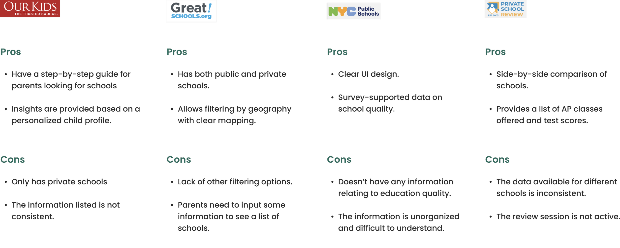
Competitive Analysis
Among the competitors, there's no easy way to quickly see if a school meets a parent's unique needs for their child's education.
Ideate
As I began this process, I defined a set of goals to guide me. This kept me focused on parents' needs and goals while brainstorming a wide range of possible solutions and ideas.
How would parents like to be helped?
From the interviews, I learned that every parent has their own unique standards for identifying a suitable school for their children, which makes it challenging to apply those standards across different platforms with varying focuses. This is how the idea of 'making it customized' came to mind. By providing information that aligns with their priorities, parents can quickly and easily make informed decisions about a school.
“My philosophy is that every child has special needs.”
Ideate
Wireframe
How do we deliver important information to parents efficiently?
Recording parents' school priorities provides customized insights and recommendations based on their preferences, making it easy to compare schools.
Presenting the information parents care about in a concise and easy-to-understand manner, eliminating the need to browse multiple platforms and read through everything.
Streamlining the school discovery and research process, parents can efficiently choose the schools they want to tour and have more time available for the tours themselves.
Usability test
Letting parents try the app
To check whether this idea actually creates a more efficient and stress-free research process for parents, I conducted a qualitative usability test with four participants.
The challenge
During testing, I was surprised to find that most of the participants chose to skip the survey. I conducted a quick survey focusing on why people wanted to skip a survey, and below is what I found:
80% of parents chose "I want to see the app first" as the reason for skipping the survey.
70% of parents stated that they would be more willing to participate in a survey if they believed it would enhance their user experience.
“ I want to skip the survey.”
The action
1. Make the survey easily accessible for parents who have skipped it.
2. Showing what the survey can do for parents during the onboarding.
After the adjustments, the number of people taking surveys increased by 70% during Hi-Fi usability testing.
The result
I gathered feedback from eight peers and my mentor to make two major improvements to my design.
Improvements from iteration
Final Prototype
Interactive Prototype
Style guide
As an app designed to assist parents in finding schools, I aim to convey an educational, classic, and trustworthy atmosphere. I picked green as the main color because it symbolizes education and is a common choice for schools, reflecting their history and traditions.
For the headings, I've opted for the PT Serif font, which exudes a classic and trustworthy aura. For the body text, I've chosen the DM San font for its simplicity and ease of reading.
Let users take the lead in design: When faced with multiple design ideas, I used to struggle with making a decision. Until my mentor told me “just test it with the users”, which helped me greatly in the design process. By collecting feedback from users and peers, I not only determined the best design but also gained inspiration for new ideas that I am proud of.
Focus on the "why" instead of the "what": As a new product designer, I often relied on the design processes I learned in class without considering why I was implementing them. I now understand the importance of having a clear goal in mind when choosing a design method.
Things I’ve learned
Improving survey response rates: While working on a project, I faced the challenge of collecting survey responses. This led me to wonder how I could increase the likelihood of people taking surveys in general, particularly to gather useful information to improve user experiences. In the future, I would like to conduct further research in this area.
What’s next
Next project: AI health>
