About this project
Arcane Herb is a family-owned herb shop operating for 40 years in Chicago. Currently, it wants to expand its market by establishing a brand for its products to reach a broader audience.
Overview
Develop an intuitive e-commerce website that enhances brand recognition, improves user shopping experience, and boosts sales.
Goal
In this project, I was heavily involved in the marketing and the end-to-end design process of building the e-commerce platform.
This involved conducting user research, creating the information architecture, building a design system, conducting usability testing, and building high-fidelity prototypes.
My Role
Duration
November 2022 - June 2023
Web design
Design System
User research
Usability testing
High Fidelity design
Marketing
Skills
Team
3 designers, 1 product manager, 1 engineer
The problem
Arcane Herb is struggling to reach a broader audience.
For over 30 years, Arcane Herb has been serving its customers based on a physical storefront. With the growing shift in consumer behavior towards online shopping, the absence of an e-commerce website limits Arcane Herb’s ability to reach a broader customer base.
An e-commerce platform to retain existing customers and attract new ones.
The solution
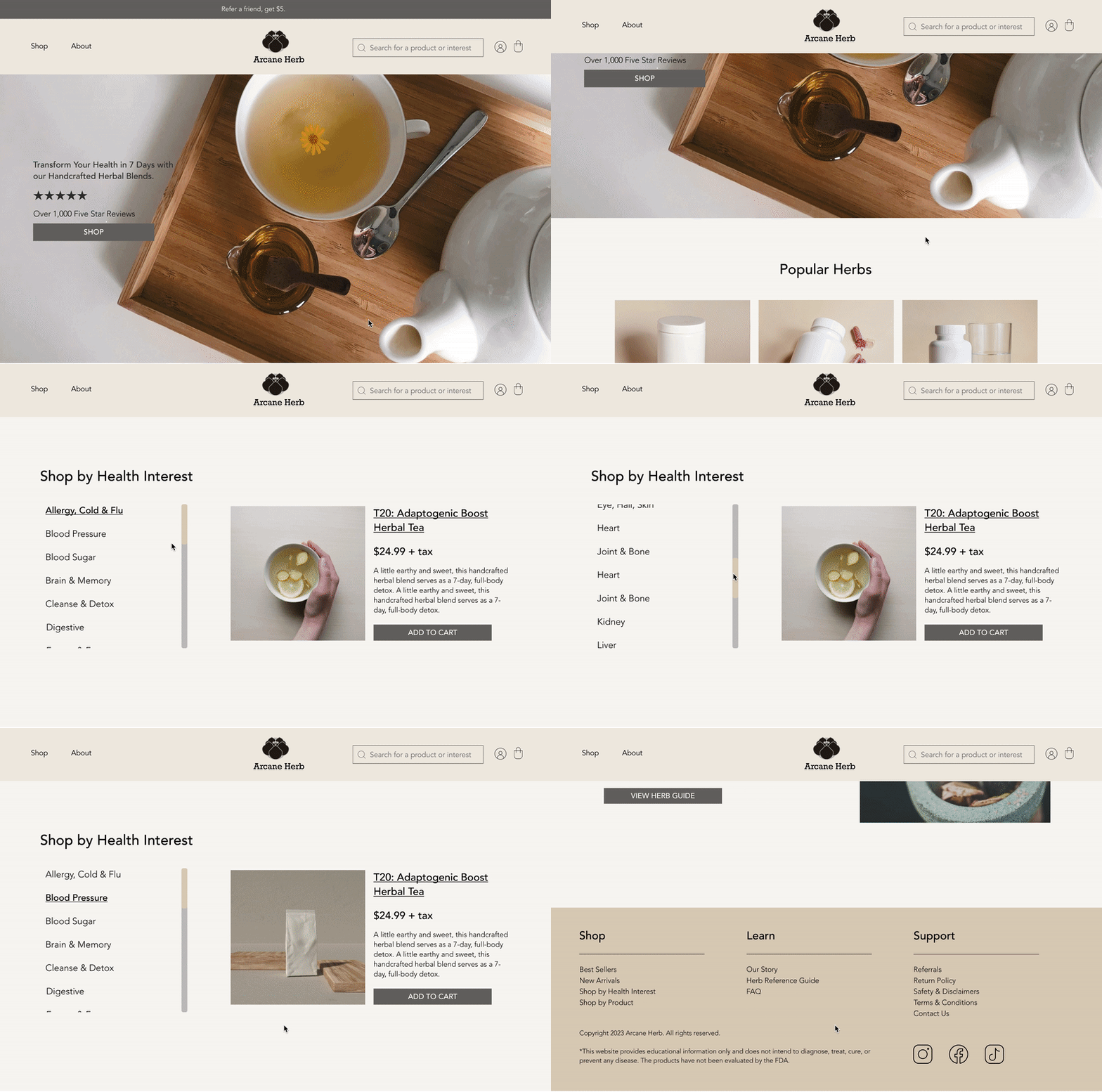
Minimal, modern design made accessible for every age group.
Design made simple and modern, in alignment with the brand identity.
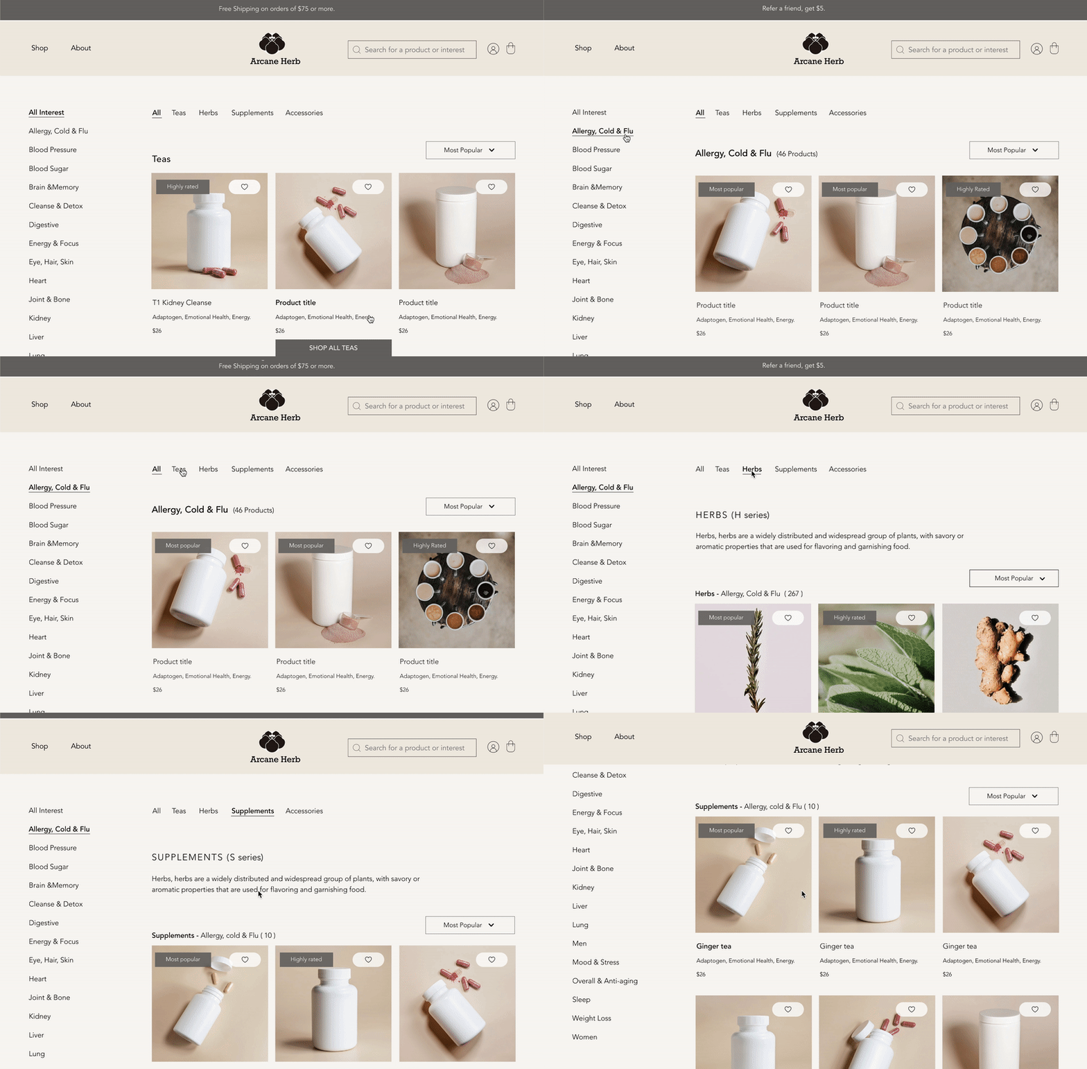
No more getting lost in the sea of hundreds of products.
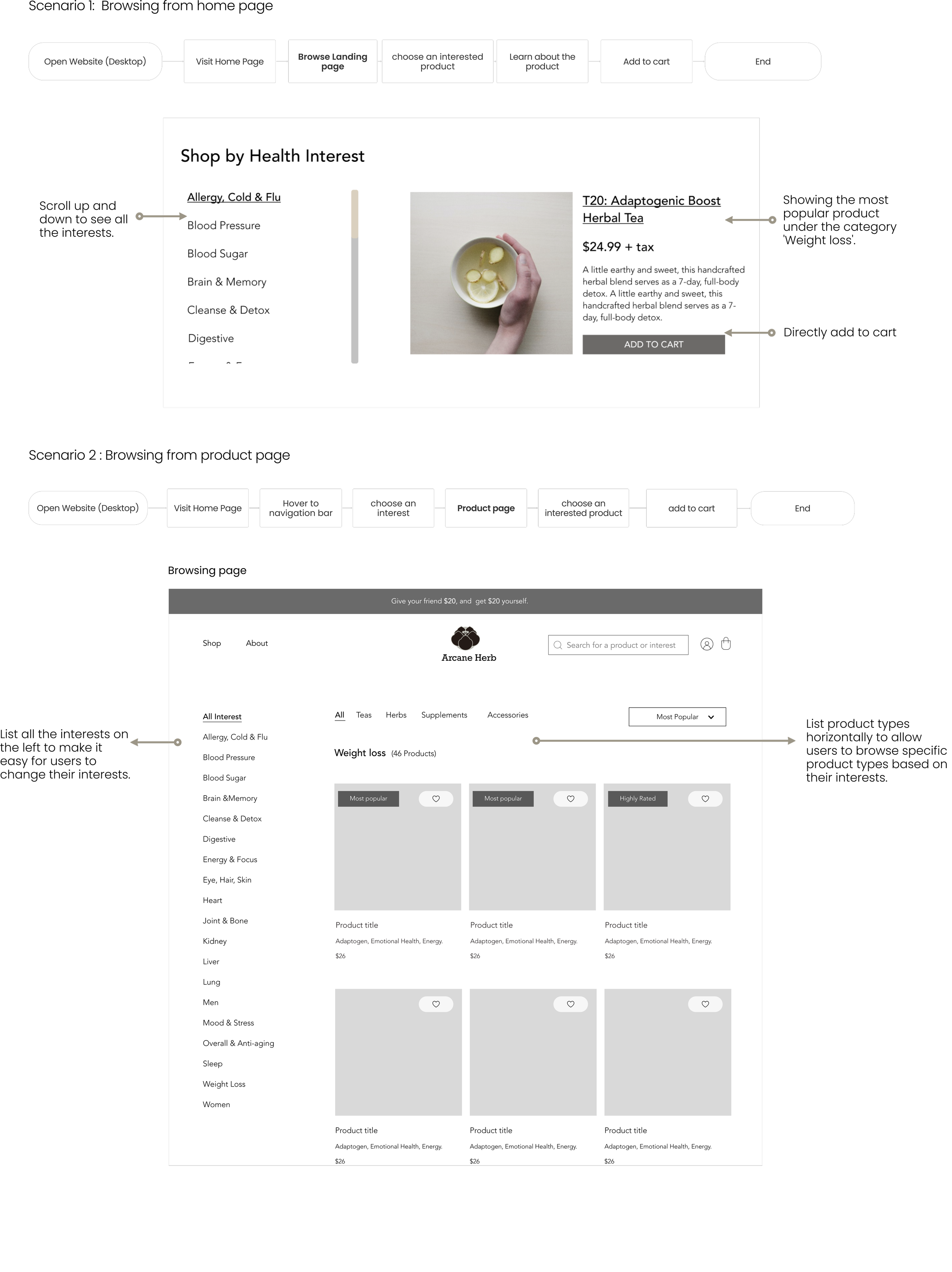
With the minimal navigation bar, customers can easily browse for products based on their interests or product types.
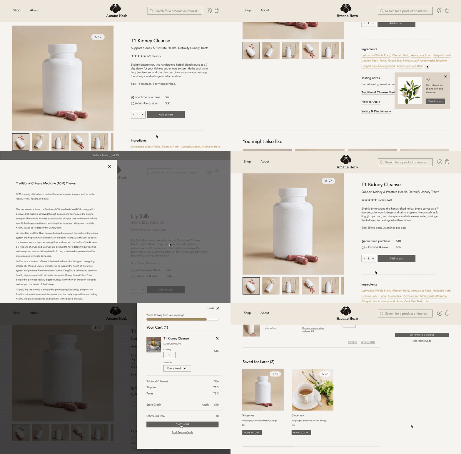
Learning about herbal products the quickest and easiest way.
Detailed information about herb products sorted in a way that satisfies both thorough and casual researchers.
User research
Collecting insights from 100 people.
Before designing, we wanted to know who is our audience and what their priorities are. To achieve this, we surveyed 100 randomly selected participants, aiming to gather feedback quickly and efficiently from a broader audience.
Define target audience
After analyzing answers and data from the survey, we identified our audience with the following traits:
Who is interested in herbs?
Insights
How do herb customers shop, and what do they care about?
Insights we synthesized from user data:
Competitive analysis
To help us make strategic design choices, we researched four main competitors: Gaia Herbs, Biokoma, For the Biome, and Mountain Rose Herbs.
Learning about the competitors
Define
To ensure the e-commerce website meets business objectives while fulfilling user needs, we communicated with our client to understand their business objectives and conducted user research. Based on our findings, we came up with the following design goals:
Design Goal
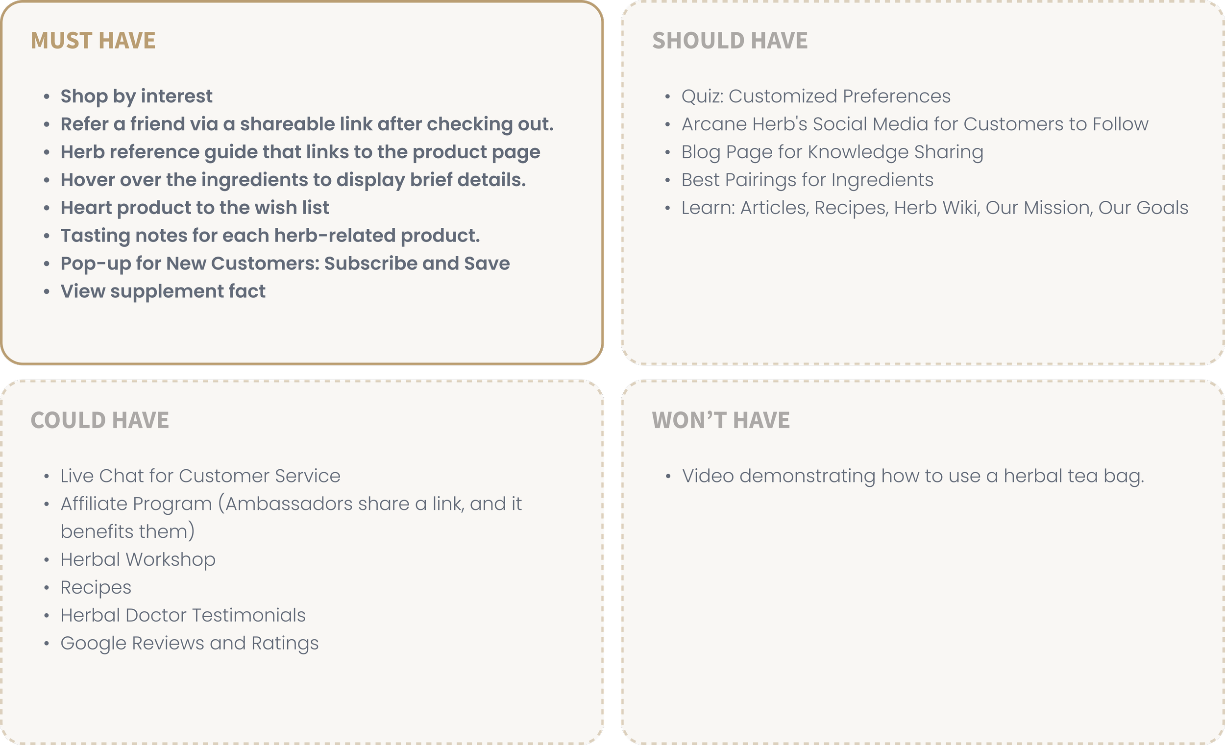
Ideation - Feature prioritization
With our design goals in mind and insights gathered from researching competitors, we began brainstorming potential features. I organized a feature workshop with the client to work together on prioritizing features based on user experience, business goals, and technical feasibility.
What need to be built first?
Ideation
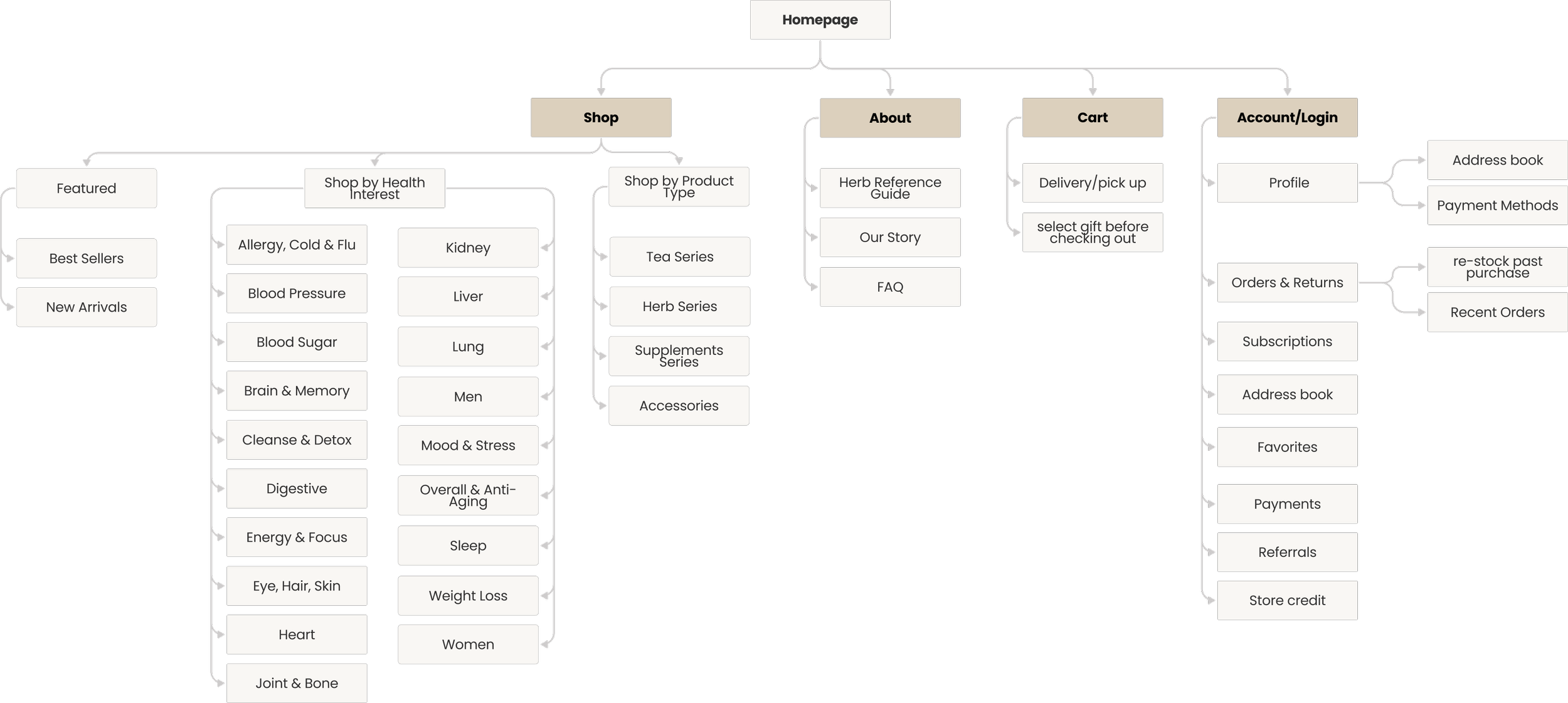
Arcane Herbs offers over 1000 product types, we aim to keep the navigation options to a minimum and straightforward. Therefore, we created this site map that helps us ensure a clear and organized user experience:
Site map
Wireframe & Prototype
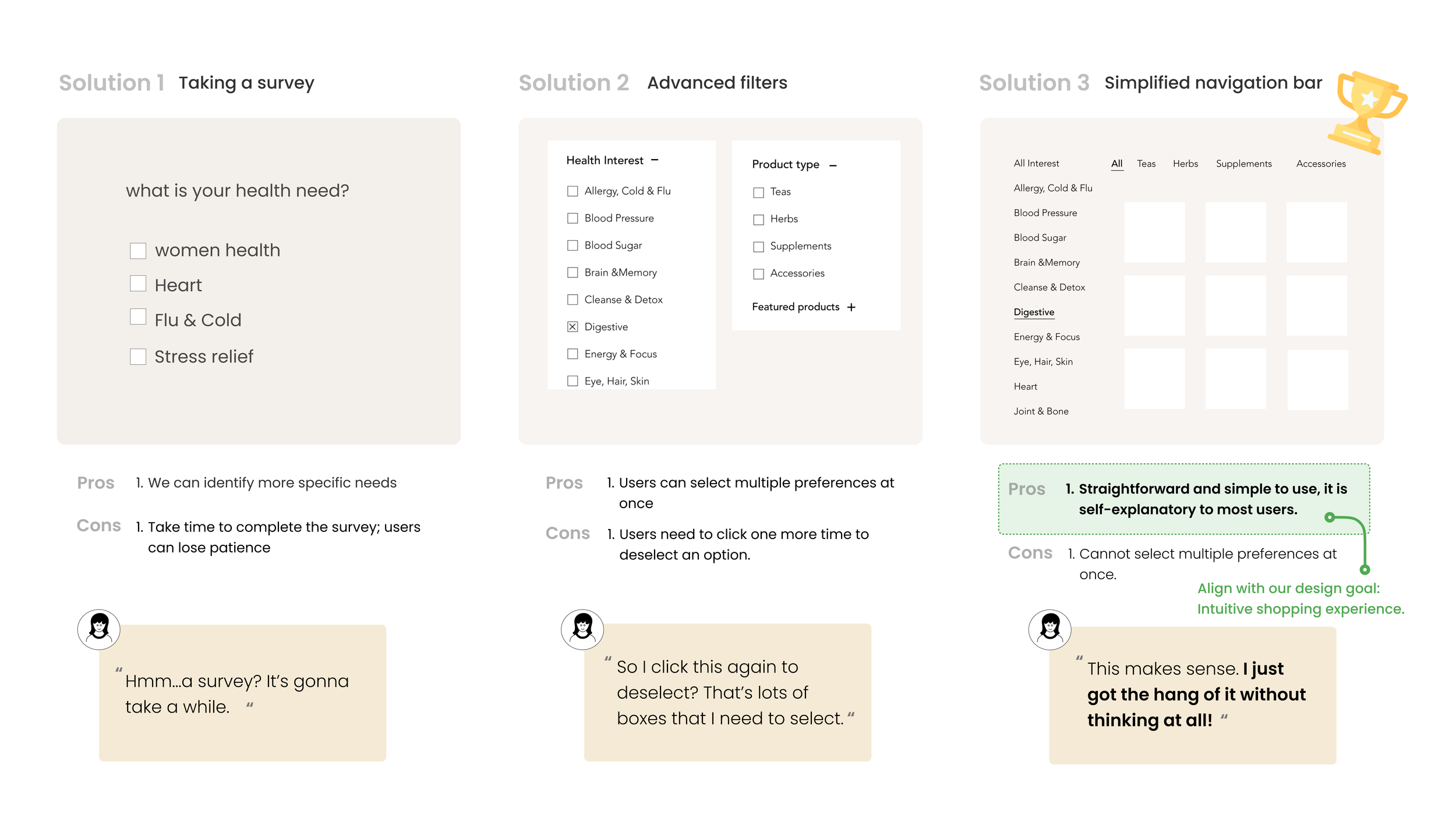
With hundreds of herbs available, how can users quickly and easily find products that suit them?
We built three different solutions and tested them with users:
Interaction design for simplified navigation bar
How can we help users learn about these products without overwhelming them?
After three rounds of rapid sketches, we decided to build an ingredients reference and created two different versions, testing them with potential users. All of the participants believe that version 2 works the best:
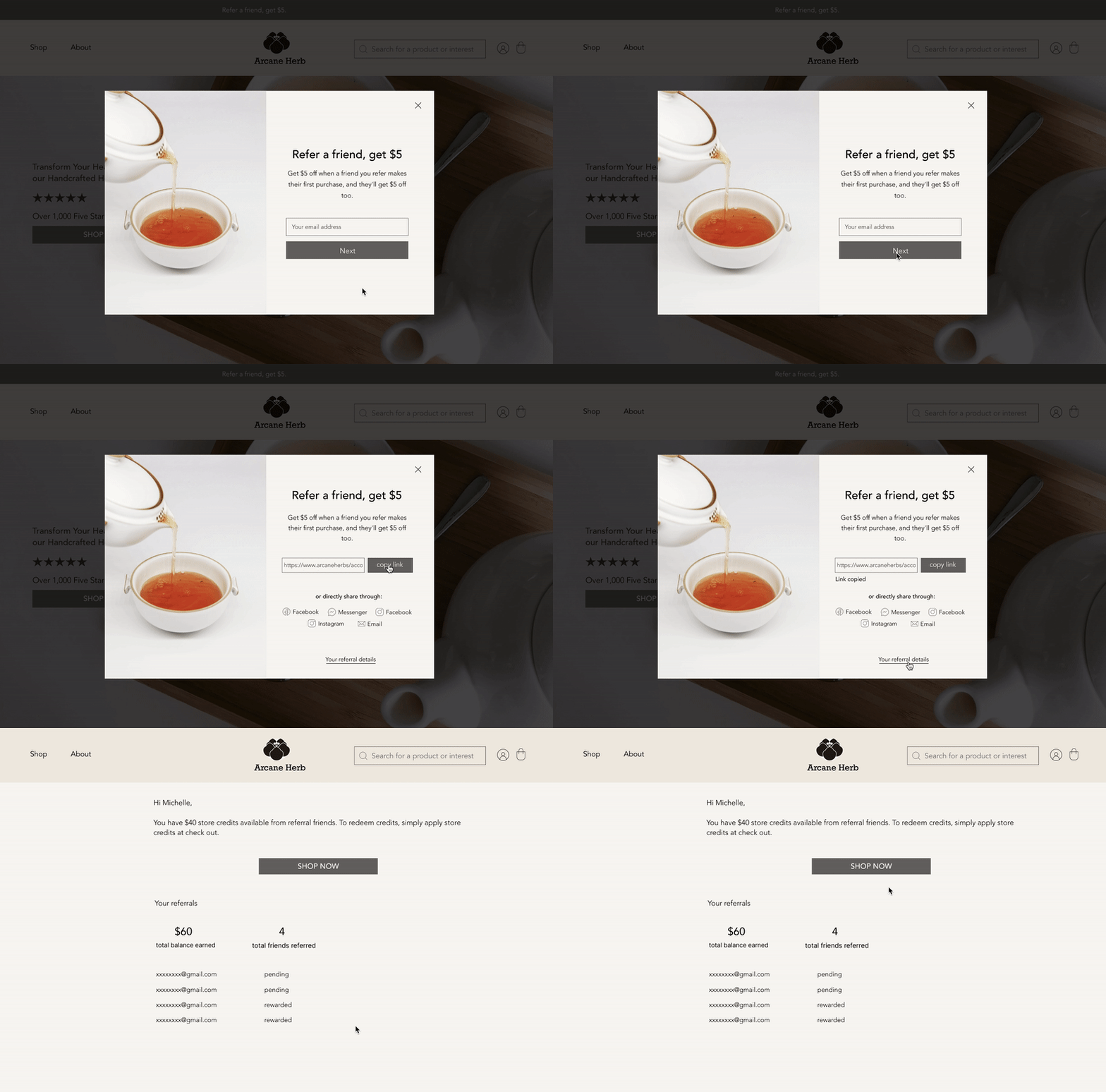
How to help Arcane Herb maximize sales?
Insights from research: People are more willing to try herbal products when they receive recommendations from friends and family or health professionals.
Design decision: Make referrals easy and rewarding to encourage people to share their products with others.
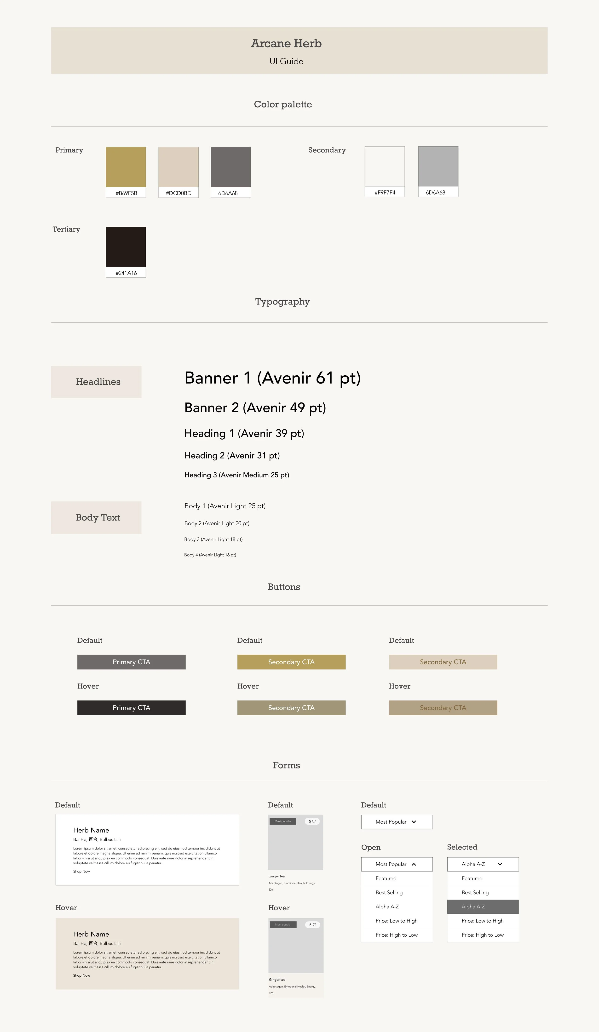
Style guide: Since it is an e-commerce platform for a herb shop, we aim to convey a soothing and calm atmosphere throughout the website. To achieve this, we used neutral, earthy tones to evoke a tranquil vibe. Additionally, we sought to give the website a modern yet trustworthy appearance; therefore, we opted for a minimal design for the overall interface.
High Fidelity Prototype:
Prioritization is important: As it was our first real-life project and the client's initial experience with rebranding its product, we were all excited about the possibilities for this platform and tried to accomplish everything. This led us to feeling overwhelmed by the multitude of tasks we were attempting to achieve. However, we all learned that with limited resources and a timeline, it is important to establish prioritization at the beginning of the project.
Communication is the key: During the 6 months of collaboration, there were challenging times for us to collaborate effectively due to our team being located in different time zones. However, we embraced open communication and supported each other to complete this project. In the end, we successfully delivered a product that both the client and customers were thoroughly satisfied with.
Reflection
Next Project: Jubilee>

