About this project
Goal
Redesign AI health to enhance the overall user experience.
As the only UX designer, I collaborated with the product manager and engineer to map the user journey, redesigned the health dashboard by building wireframes, interactive prototypes, usability testing, and data visualizations in Figma.
My Role
Timeline
Jun 2023 - Jan 2024
Data visualization
Data analysis
Strategic Thinking
User research
Wireframe
Prototype
Skills
Team
1 designer, 1 product manager, 1 engineer
AI Health is a startup that offers a health data-based dashboard, which allows users to access their health reports conveniently. As a company that generates revenue through ad promotions by providing health recommendations to users, it is currently struggling to maintain profitability due to a low click-through rate of only 5%.
Background
Enhance the overall user experience and ultimately increase the click-through rate for promotions.
Business objective
The impacts
At the end of this project, the features I implemented in the dashboard have successfully increased the click-through rate for promotion by 30% and user satisfaction by 20%
To ensure that I delivered a user-centered solution while achieving business objectives, I conducted user interviews to better understand what users need. Through this process, I identified the two main problems:
The problems
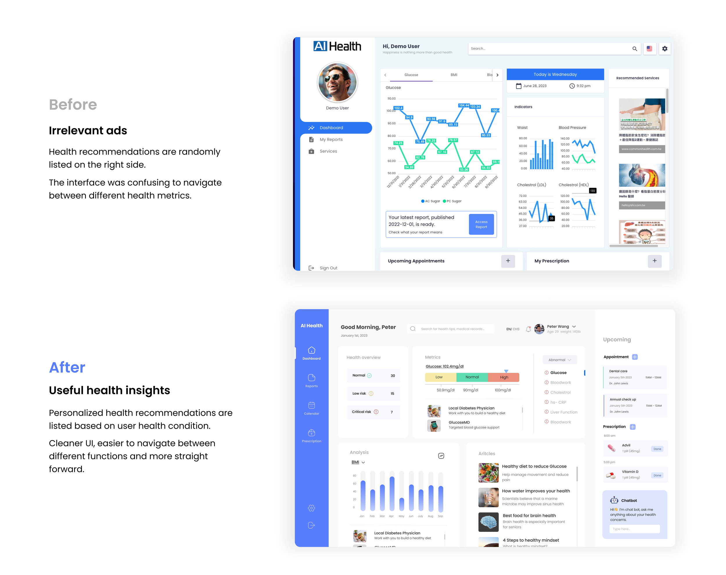
Decoding medical terms into simpler language, such as 'normal' and 'abnormal.
Solution: Addressing problem 1
Solution: Addressing problem 2
Transforming irrelevant ads into personalized health recommendations.
The result
A Huge improvement.
After implementing the new features, we conducted usability testing with 6 users to evaluate the effectiveness, efficiency, and satisfaction of the new design. The results show a significant improvement.
Starting by making the product desirable.
Back to where it all started
To ensure AI Health met its business objectives, I adopted a strategic approach. Prioritizing user needs, I focused on enhancing product desirability before diving into ad implementation.
Empathize - User research
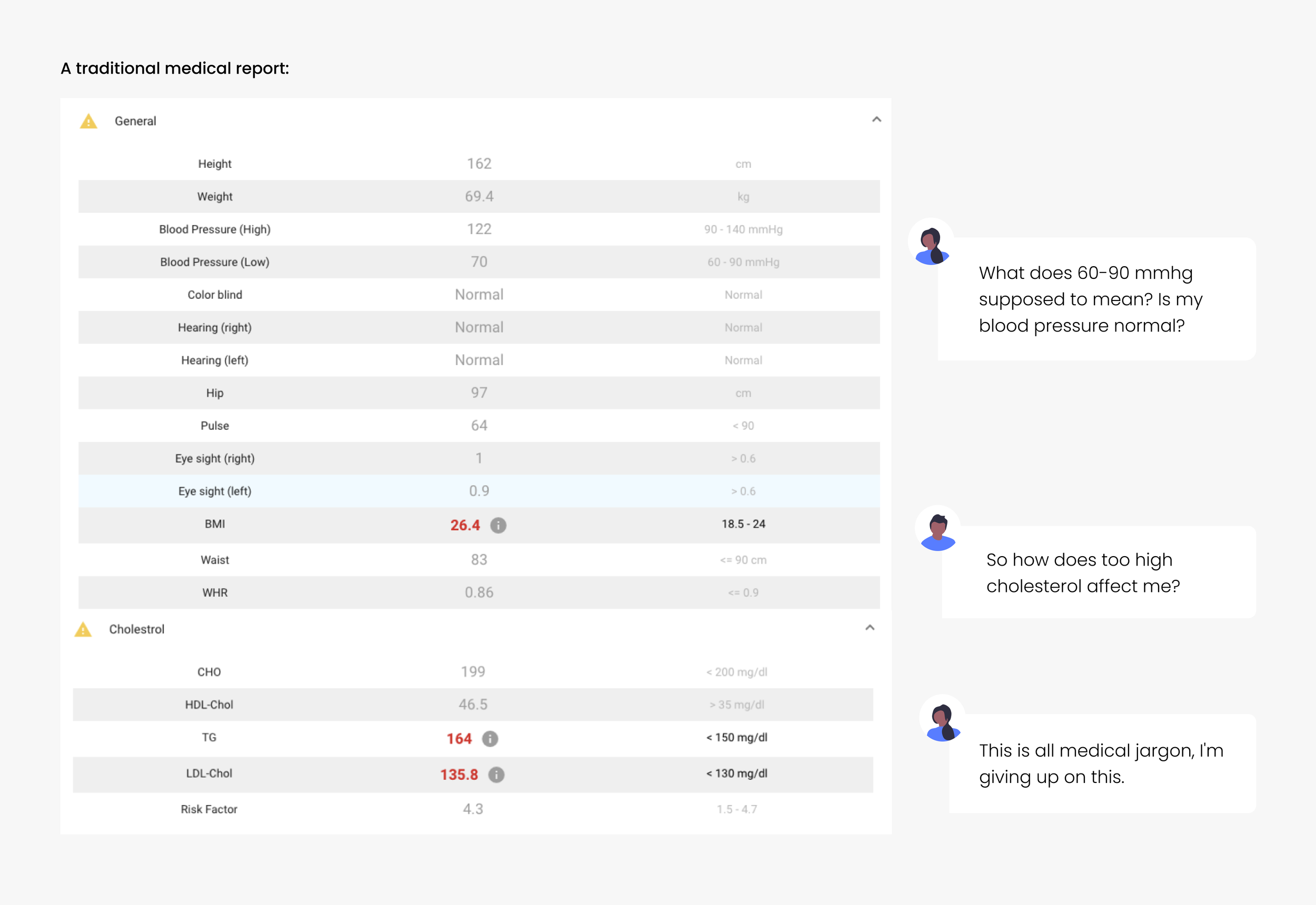
People find medical reports difficult to understand.
I interviewed four potential users to learn about their experience with medical reports. I find out that users have difficulty understanding health reports. As a result, they don’t engage fully with the information provided.
Empathize - Evaluate the original design
The current design does not assist users in understanding medical reports.
To identify improvement points in the current design, I conducted usability testing with four potential users using the original design, and below are my findings:
Users need to understand complex medical reports to be empowered to take actionable steps towards addressing potential health concerns.
Define - Problem Statement
Define - Design Goals
After the discussion with the product manager, we defined the following primary goals to guide us throughout this project:
Problem: How can we improve user comprehension of complex health data?
Ideation & Prototype
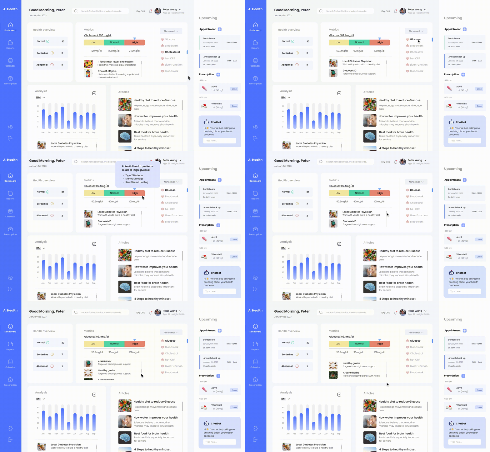
Solution: Implementing data visualization that decods the medical data into compelling visuals.
The complexity of medical reports often stems from technical jargon and numerical data that can be confusing for those without a medical background. To address this, I focused on replacing these elements with clear and concise language, such as "normal," "low," and "high.”
Ideation & Prototype
Problem: When can health recommendations be useful for users?
When a user discovers a potential health problem, they will likely want to conduct further research or take action to address any issues. Having all the relevant recommendations available when needed could help users save time on additional research.
Solution: Turning recommendations into actionable insights specific for their health interest.
Iterate - Gathering insights
Getting Feedback from Engineer and Product manager.
In the ongoing iterative feedback loop with the Project Manager (PM) and the engineer, I have consistently received feedback for incremental improvement over time. Here are the changes we agreed upon:
Deliver - High Fidelity Prototype
After many rounds of iterations… The final prototype
Home page dashboard: In just a few minutes, users can gain a comprehensive understanding of their health condition through their health report and take appropriate actions.
Medical report page: A medical report translated into everyday language with icon and data visuals, eliminating medical jargon and simply indicating normal or abnormal findings.
Style Tile
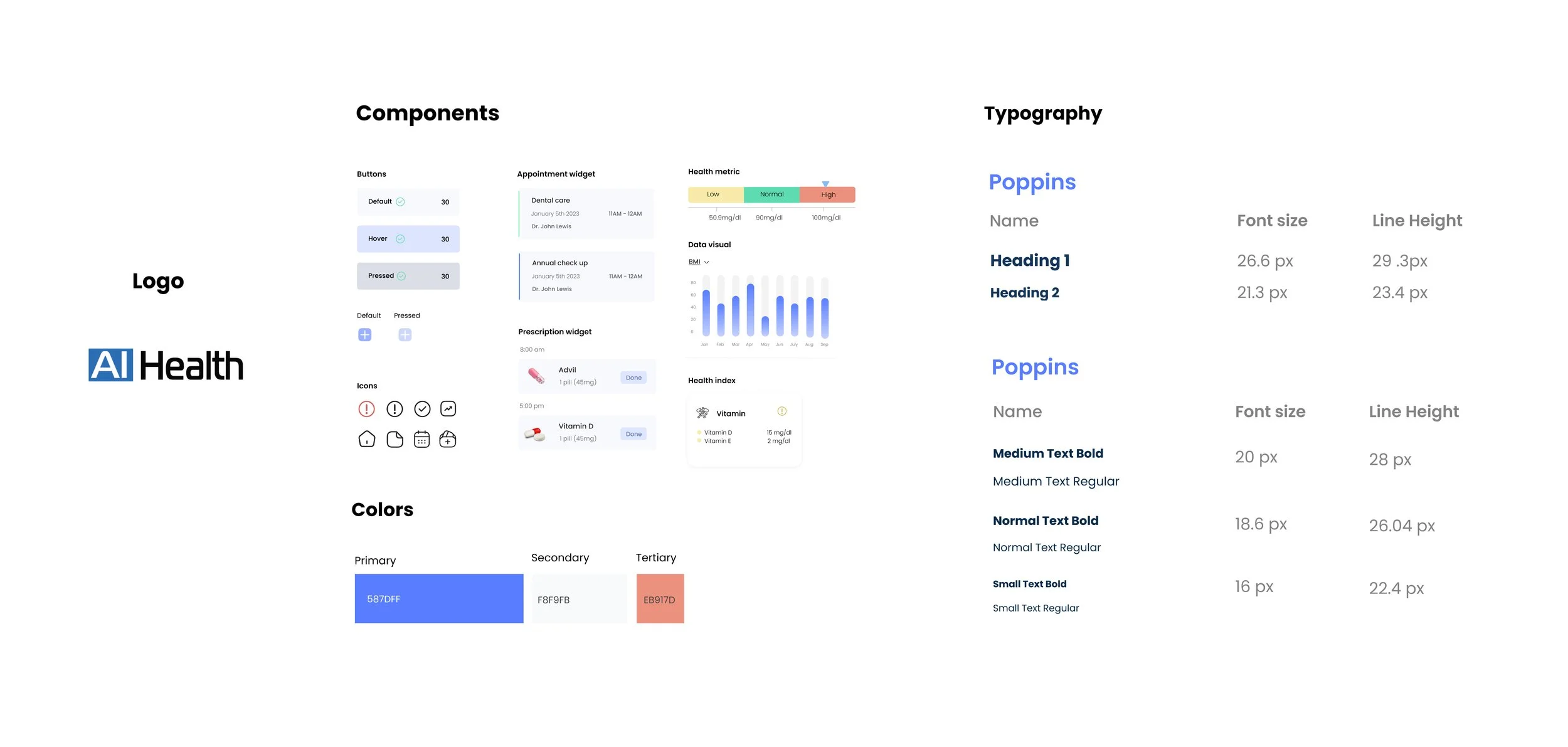
Color choice: I chose blue as the primary color as blue represents a sense of calm and health while also conveying a trustworthy feeling.
Typography: Going for a contemporary and professional appearance, I selected Poppins for its modern and friendly vibe, complemented by a touch of sophistication.
Reflections
Embrace constraints as your source of inspiration
The stakeholder's top requirement was 'maximize ad display.' Balancing this with user experience challenges, I found a solution that served both user needs and business objectives, making ads favorable for users. Navigating constraints proved more rewarding than having the perfect answer upfront.
As the sole designer, I face challenges and creative blocks. Regular feedback meetings with the engineer and project manager prove invaluable, helping me conceptualize feasible functions and address unforeseen problems. The iterative process improves with each round of feedback.
Utilize your team
Next project: Arcane Herb>


